⭐️🎵
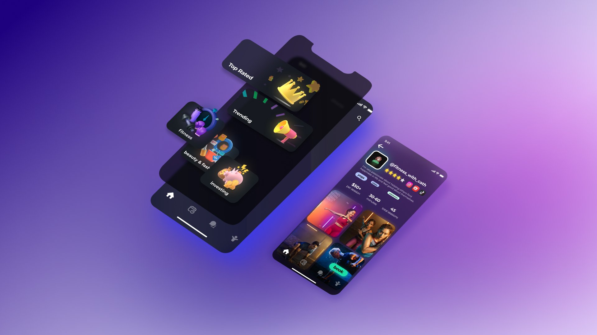
Mobile app that allows fans to interactively discover, connect, and engage with creators more organically and intimately.
Along with 1 PM and 2 developers, I co-founded this app during my semester in LavaLab, USC’s premiere start-up incubator club. I led the end-to-end design of the app, product vision and roadmapping, user research and testing, and development handoff. To deliver our final deliverables, I iterated over design mock-ups and prototypes, brainstormed in all-hands meetings with my team, and created pitch decks every week.
Duration: Jan-May 2022.
Tools: Figma, Illustrator.
Project plan
Problem statements
How might we foster sustainable, personal, and rewarding interactions between content creators and fans?
How might we empower users to crowdsource knowledge and answers from experts in these fields?
Pain points
Content creators fill us with inspiration, but there’s currently no good solution to connect with them and learn more.
Fans: Content creators currently rely on pre-recorded sessions to teach, which leave users confused and unsatisfied. Online platforms also offer limited courses in each vertical, which is not catered to the user’s exact interest.
Creators: Only the top 2% of creators make enough to create independently. The appeal of a creator career path is rising, yet there’s no infrastructure that supports the mid-tier creator when it comes to content monetization.
Fans + Creators: Both creators and fans lack interactive connections with each other and a platform to connect on an individual level.
User interviews
Since we are tackling a two-sided problem that involves both the content creators’ and consumers’ perspectives, we interviewed both:
User:
"This would make my learning process so much easier. Sometimes I come across someone’s video online and really want to learn their piece but it’s their original composition, or I’m trying to read sheet music but just can’t get it right. If I could have a face-to-face conversation with the creator, it would save so much time." - Luca, piano learner
"When I'm checking out crypto Youtubers, I'll search the comments for questions I have, a lot of the times is not there... It'd be nice to have platform so i didn't need to rely on this. A lot of teaching courses out there seem really cash-grabby. Creators feel more genuine and relatable, more like someone I'd want to interact with" - Rob, crypto trader
Creator:
"Having a platform like this facilitates the process for me to engage with my fans and weed out irrelevant DMs I get; this is especially helpful for fashion creators who can't sell lessons like other verticals can" - Nicole, fashion creator
Product specifications
To tackle these specific user pain points, I synthesized them into four main groups of product specifications to guide product feature ideation.
Competitive analysis
1.Intro
Lacks affordability (only high-tier creators)
Undesirable and limited creator verticals
Need to be redirected to their personal websites to learn more
Cannot personalize sessions
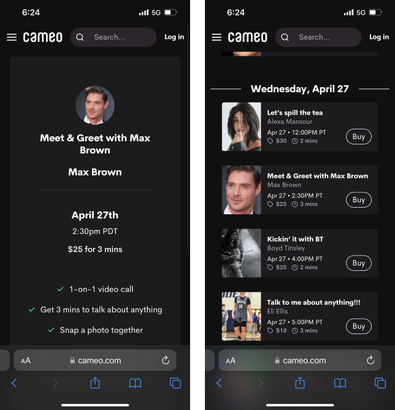
2. Cameo
Only short duration of sessions encouraged, unable to foster deeper connections
Unclear which verticals creators are in/who they are
Users unable to learn more about creators before booking
Value propositions
Focusing on affordable pricing, in-depth conversations, discoverability of new creators, and connections with communities to differentiate from existing products on the market.
Market research
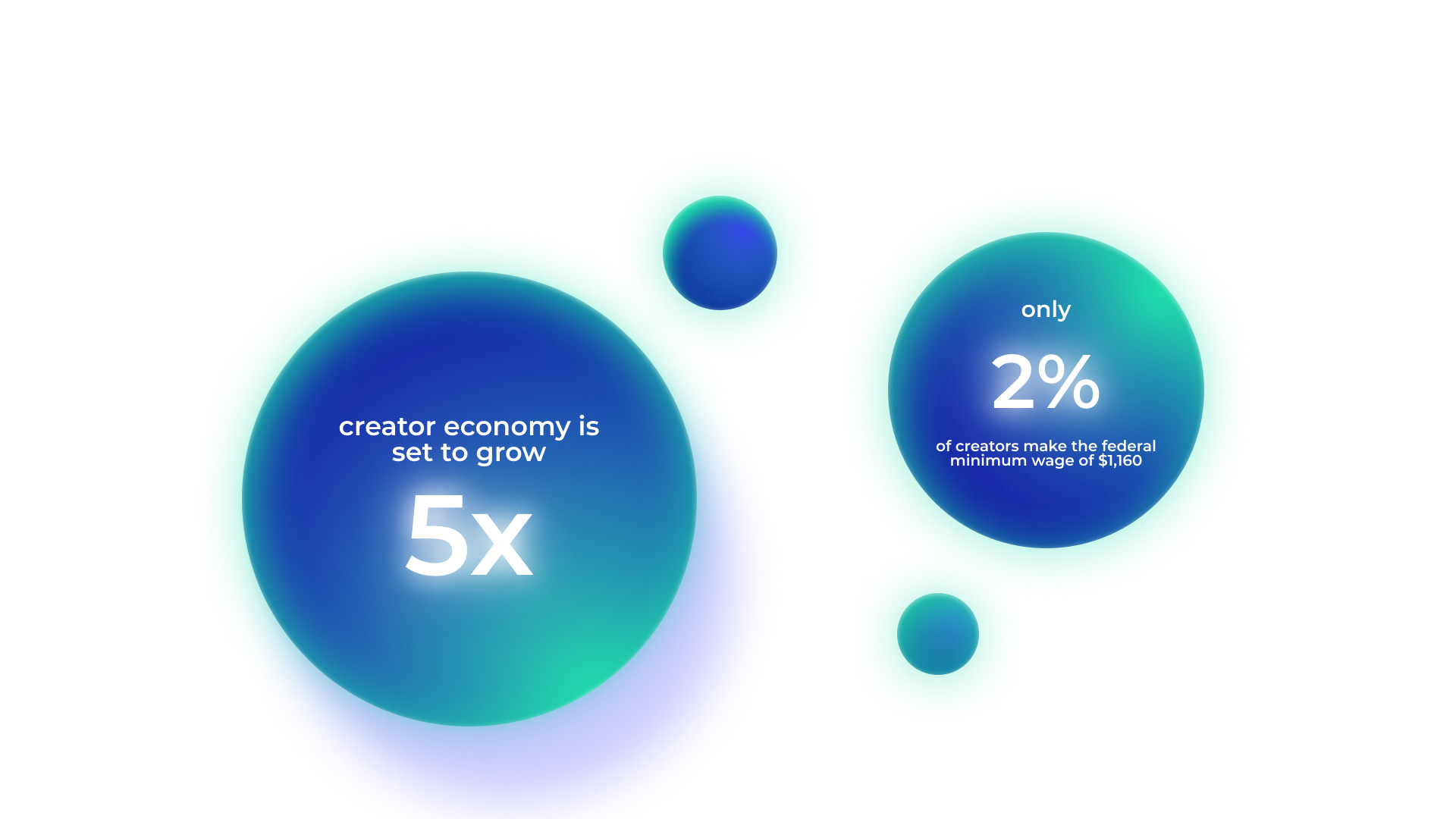
There is a huge market for both aspiring creators and users who regularly use social media platforms to explore and learn new skills from creators or participate in online learning. However, only a staggering 2% of creators can make the federal minimum wage. Our product focuses on tackling the intersection of these two problems, building up the creator middle-class and supporting users simultaneously.
User flow
When brainstorming our user flow, a main challenge was differentiating the user needs when it comes to our two groups of user base - content creators and fans. We decided to create two pipelines for either but fuse the two user experiences and curated product features to create a good balance between differentiating and merging the two user journeys.
Branding
Iterations
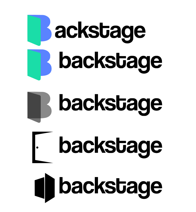
When brainstorming for the name, logo, and typeface, we wanted to capture that our app would be a dynamic, lively, and welcoming community. Here are some of the iterations I brainstormed before landing on the final design.
Final
The final logo was designed to reflect the core ideas of our project which revolved around diversity, unity, delight, and just simply bringing people closer together. I also wanted to keep it minimalist and scalable to create brand recognizability.
Explore
The Explore page gives fans the options to both organically come across more content through short videos, filter for top-rated creators in specific verticals like fitness and investing, and keyword-search for sub-categories. All shorts and creators are also tagged with their niches like yoga, calisthenics, etc. to allow for more transparency and ease of use.
Booking
Fans can book 1:1 sessions with content creators through their profiles or through search results. They can view creators’ availabilities, add guiding questions specific to their niches, and any notes to creators. The creators’ session rates, durations, and ratings are also open information. Once the booking goes through, the session automatically shows up in both users’ schedules where they may join the video chats at the scheduled time.
Analytics & scheduling
We wanted to create more transparency and ease of use when it came to content creators’ monetization. The analytics tab includes detailed metadata in terms of prospective audience projections and revenue breakdown. Scheduling also allows creators to easily keep track of their calls and events in-app.
Community
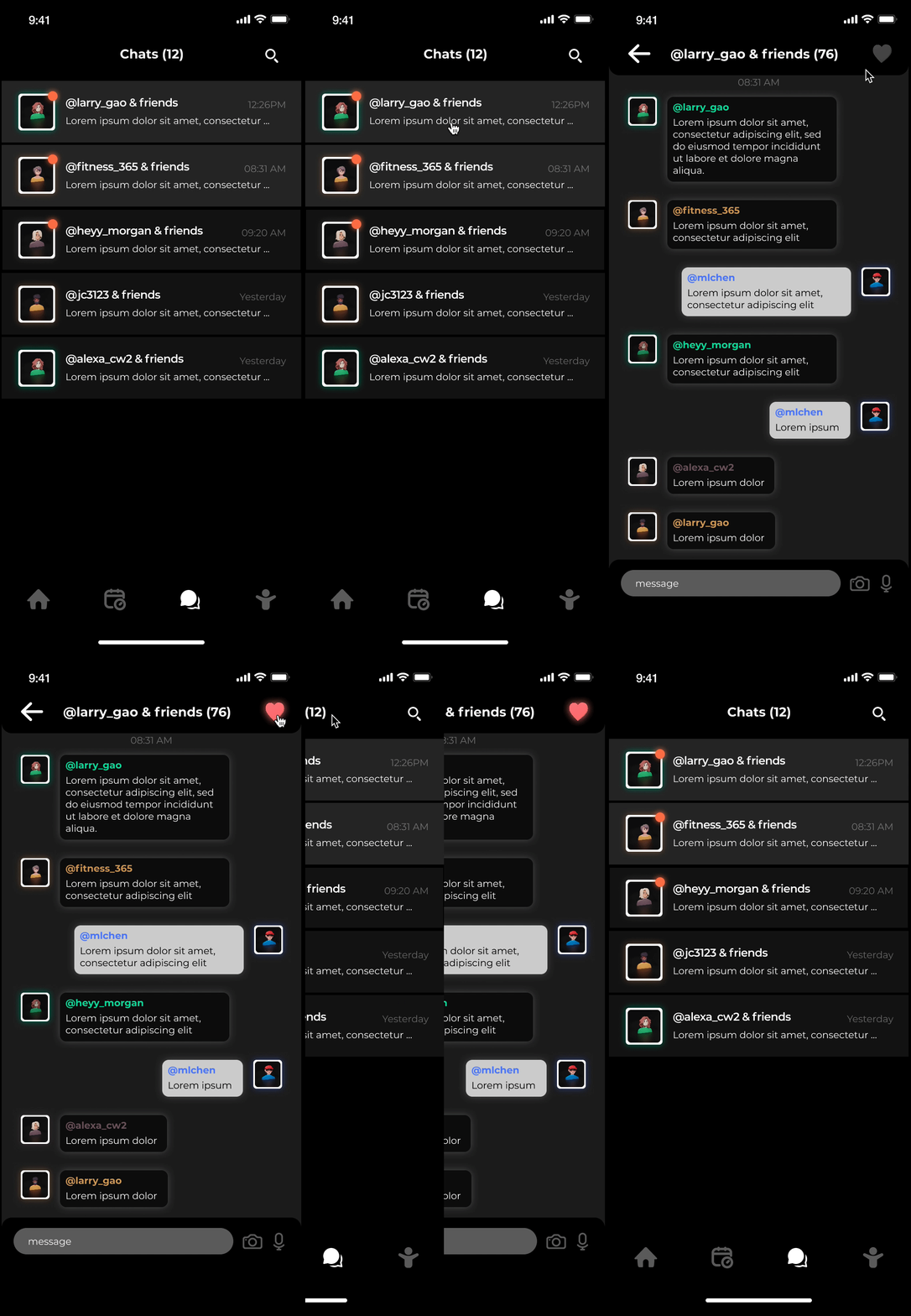
To help creators diversify their revenue streams and foster close-knit communities, we curated a tiered loyalty program for fans. Users are enrolled in group chats with creators where they can continue interacting with them and like-minded fans. With the popularization of creator events, content creators can post giveaways, exclusive deals, virtual group lessons, livestreams, etc. as a form of fan service.
Onboarding
To make sure that we are creating a safe, comfortable platform for all consumers, we incorporated a vetting system into the onboarding process to conduct background checks on creators’ linked social media platforms. Upon entering the app, users are also able to indicate whether they are trying to learn or teach, their verticals, and sessions and rates if they are a creator.
Profile
The profile pages allow fans to easily access in-app payment methods, booked creators, create and upload content, and design their profiles including bios, verticals, and social media.
Pitch deck
Take a look at our slide deck used for the final Pitch Night below, complete with more information on business model, user stories, go-to-market strategy, and next steps!
Key takeaways
On Demo Night, we pitched our start-up to 3 VC’s and received the Judges’ Choice Award as well as $1000 of seed money.
Shoutout to my awesome co-founders, Valan, Jasper, and Henry!
Do not become too attached with any ideas
Throughout our 4-month long sprint, we’ve had to pivot countless times due to unforeseen problems. It’s easy for designers to become attached to their designs, but it is even more important to learn when to let them go for the betterment of the final product.
It takes both speaking up and active listening to have good team communication
Working in a cross-functional team of designer, PM, and developers, it’s easy to feel like your voice is lost when everyone has such great ideas to share. It’s only when we’re all letting each other feel heard, not being blindsided by our own expertise, and reminding ourselves that we’re working toward the same goal when we make the perfect team!


