🛠
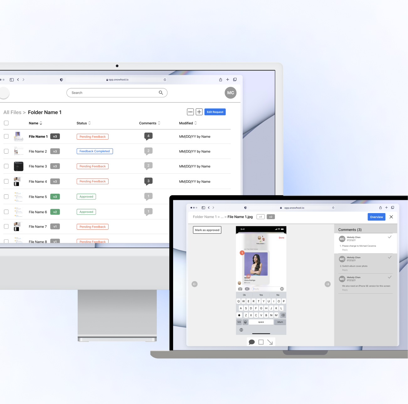
As part of my summer internship at Apple, I designed a desktop platform that operationalizes the way in which cross-functional communication and design feedback is provided and resolved at Apple.
A two-phase strategy targeting the problem of the inefficient feedback loop for communication of design feedback between multi-functional teams. Phase I’s goal was to improve the current design and review process with existing tools and workflows that were already easily accessible to all employees today. To take the solution one step further, I designed Phase II, the goal of which was to develop a new system or tool that could allow the cross-functional teams to provide and resolve design feedback more easily and efficiently.
Duration: May-Aug 2021.
Tools: Figma, Photoshop, Keynote.
The problem.
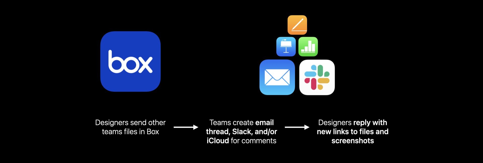
Across different teams and orgs, the task of providing and receiving design feedback is done everyday, but many of these cross-functional projects must resort to using the lowest common denominator regarding communication. Because this feedback workflow is not defined, design feedback can come in the forms of email chains, slack threads, Numbers spreadsheets, and even Keynote slides.
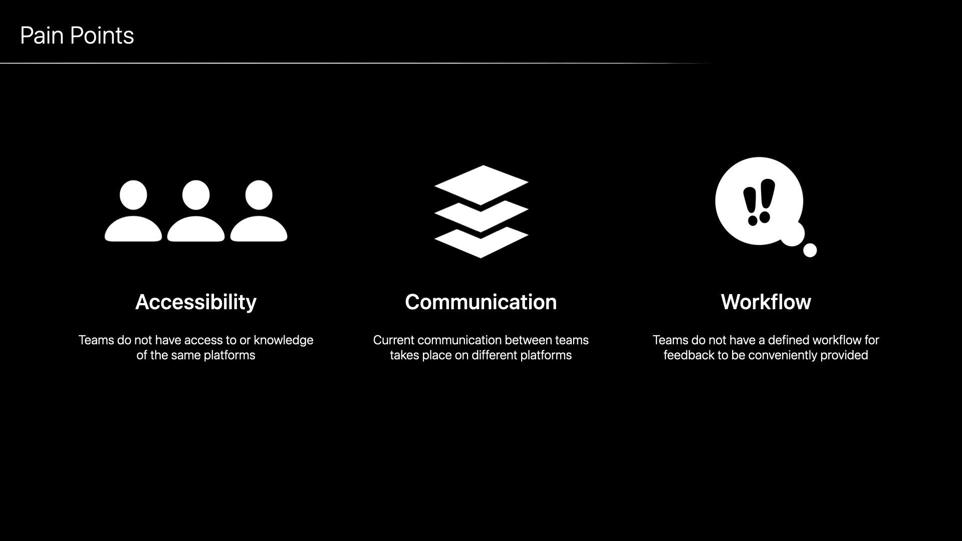
This has created numerous challenges to teams all across the board, which could be summarized into these three major pain points. First, teams run into the problem of not having access to or knowledge of the same platforms depending on their teams and positions. Second, the current communication take place on different platforms, which makes it difficult to navigate in an organized fashion. Lastly, teams do not have a defined workflow for feedback to be conveniently provided with the least friction possible.
Stakeholders and teams with buy-in.
I communicated closely with these five cross-functional and cross-org teams in order to gauge the full scope of the problem and communicate with the perspectives of screen artists, human interface designers, project managers, content designers, and product developers.
Product Asset Management
HI Producers
Media Products Design
Product Tech Services
Content Design Producers
Existing internal work process context.
Email Threads (up to 40+ replies regarding a design feature)
Numbers Spreadsheets (manually organizing the comments and attributes of each asset into a table)
Keynote Slides (in order to annotate using built-in shapes and arrows and then adding text boxes)
SWOT analysis.
Within the integrated tools, email provides only linear communication and doesn’t allow for collaborative work. Similarly, Slack is mainly conversational but hard to track in a permanent and long-term way. Quip allows for real-time collaboration, but is antiquated, hard to use, and has only limited capabilities for annotations. Similar to Quip, iWork is good for easy collaboration but is inherently limiting with file sizes, access restriction, and version control history. All in all, the four platforms are all quite cumbersome when actually implemented into the workflow.
Figma and Frame.io are access-restricted tools that some teams are integrating into their workflows. They have built-in collaboration and annotation tools that can be valuable to the teams when it comes to straightforward and visual feedback. But although both are being developed internally and will be used within Apple, we must acknowledge that the biggest hurdle to implementing them cross-functionally is that it has a high barrier to entry and is hard to use outside of specific design teams and across different orgs.
The solution.
[phase I]
To improve current design and review process with existing tools and workflows accessible to us today.
That’s why I landed on Box for the Phase I strategy. While Box has mainly only been used as a file storage tool previously internally at Apple, I explored the built-in commenting and annotating tool extensively and founded that there is actually great potential for Box to be developed into a feedback tool as well.
Integration into current workflow.
In order for the Phase I strategy to hit the ground running since day 1, I’m proposing that the comment process for one asset or group of assets take place within a single link and platform on Box. Also, since Apple employees sign in to Box through the Apple Directory, teams can refer to how-to tutorial videos that delineate the steps of using Box to provide or receive feedback.
Hurdles
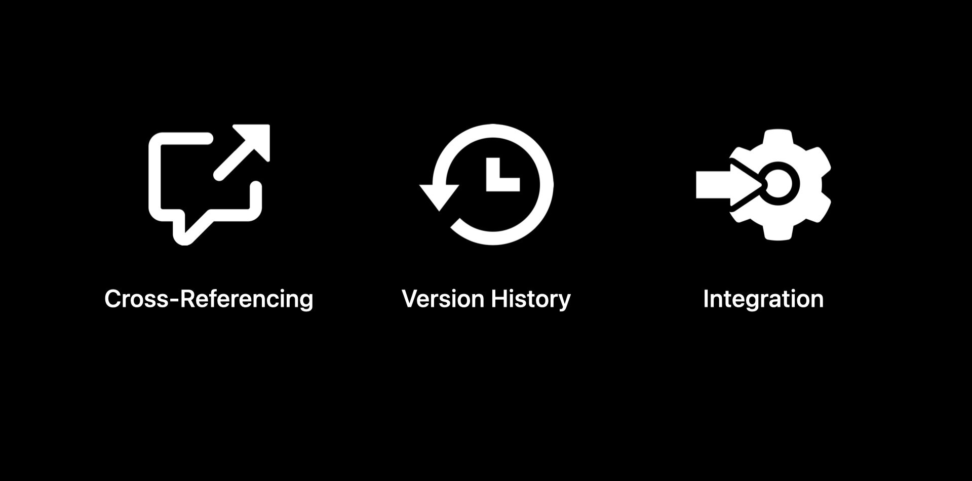
But although Box may fulfill parts of the needs of the design and feedback teams, there is a lack of more sophisticated commenting tools, version history control, and integration with project management workflows.
Cannot cross-reference between screens or batch comment (include a comment that pertains to several screens)
Cannot differentiate at-a-glance the new version changes and comments at folder hierarchy, or color-code/label completed/no longer needed files in the folder to avoid confusion
Cannot move comments outside of Box - cannot export into file/text or import into Wrike/other pm tools
[phase II]
To develop a new system or tool that allows cross-functional teams to provide and resolve design feedback easily and efficiently.
Pain points + solutions.
Communication tool must have a low barrier of entry for all teams to use
Feedback process must take place on a single platform
Teams must be able to efficiently and visually leave feedback on assets
User flow.
Wireframing.
After meeting with my manager, mentor, and team members to create around 6 iterations of the wireframes, I landed on the final version that could help move me to the high-fidelity mockups I would create in Figma.
Prototype.
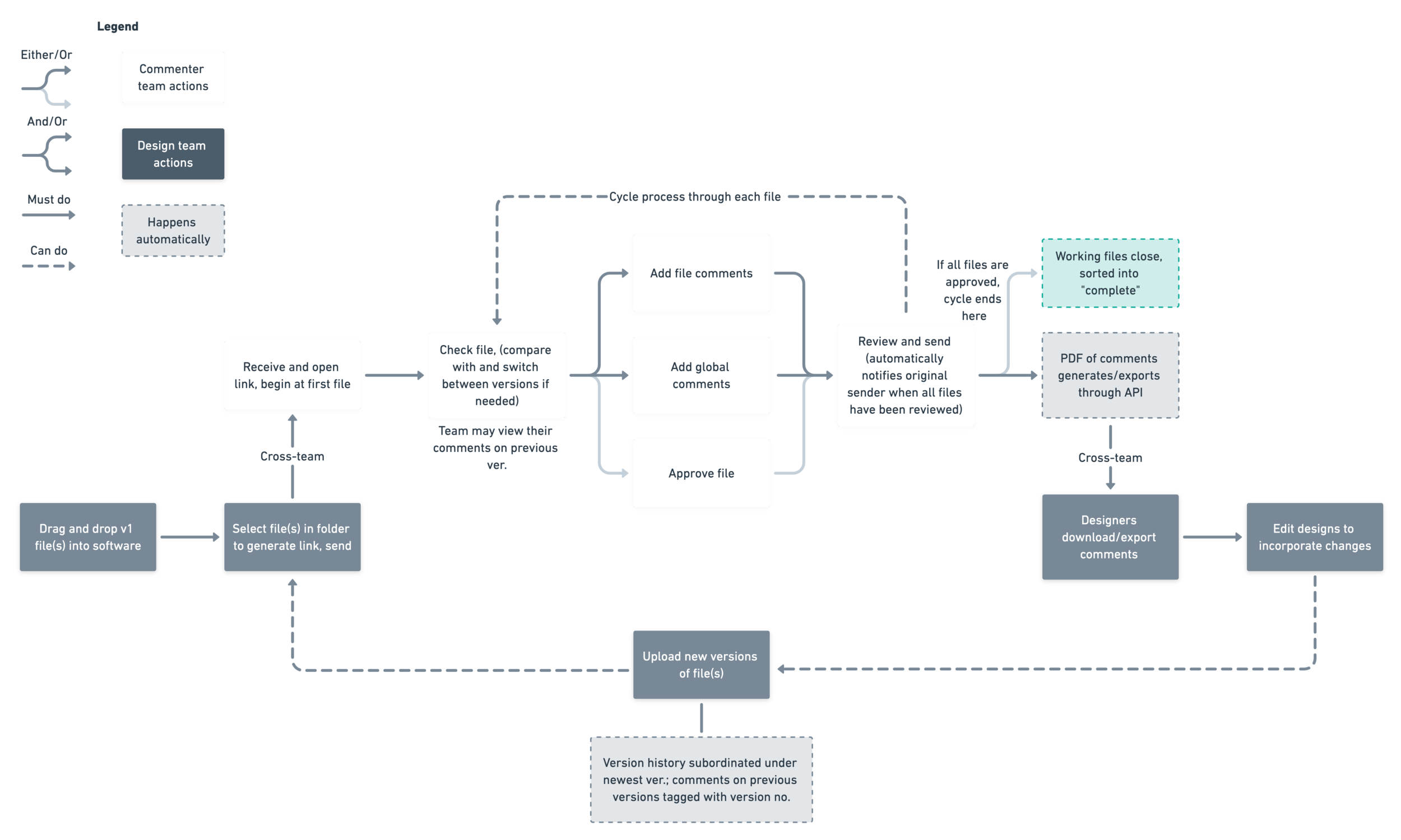
Similar to the method of Phase I, I also separated the structure of my design for Phase II to support two different user flows that correlate to the one I have delineated above. In order for the platform to have the lowest barrier to entry possible, I designed it so that the two user flows could switch seamlessly between each other and for either commenters’ or designers’ views to be cohesive and similar interface-wise.

